Redesigning Hubble: An Internal Debug Platform at Coupang
As a UI/UX Design Intern at Coupang, I led the redesign of the Hubble Debug Platform, a powerful internal tool used by engineers to debug and optimize system performance.
Project Overview
Hubble plays a crucial role in identifying issues, reviewing query data, and comparing ranking results across multiple test groups.
My objective was to improve usability, visual hierarchy, and overall user efficiency by redesigning the interface and reorganizing key workflows—transforming the tool into a more scalable, intuitive, and productive workspace.
Problem
Problem Statements
From a designer's perspective, these were the problems I found from current design...
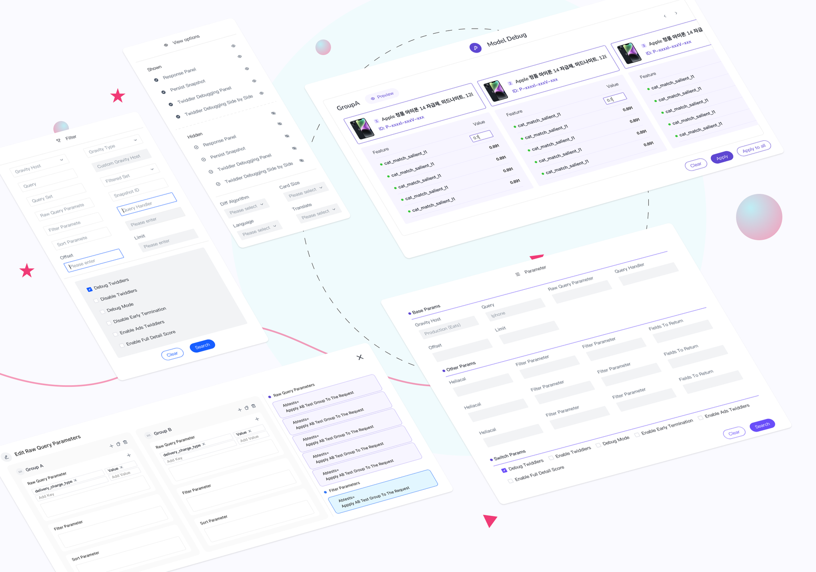
Layout
01
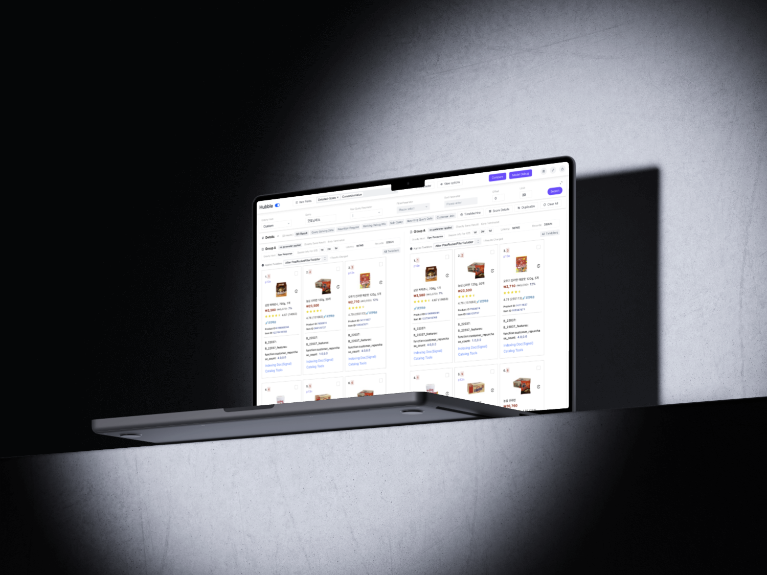
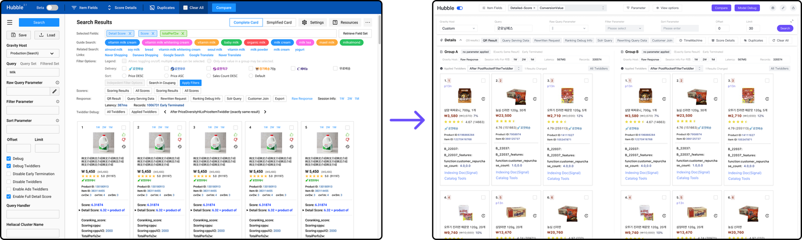
The original L-shaped layout left only a small area for displaying result cards, making side-by-side comparisons difficult and reducing overall usability.
Hierarchy
02
The interface lacked a coherent structure. Related tools were scattered without clear grouping, making it hard for users to locate functions quickly.
Features
03
Over time, many legacy features remained visible even though they were no longer used. These cluttered the interface and contributed to slower performance.
Customization
04
Important functions like filters and parameter editing were fragmented across multiple pop-up windows, making it difficult for engineers to customize and adjust queries efficiently.
What Our Engineers Says
From users' perspective, these were the problems our engineers found out...
“The left form takes up space I don’t need most of the time.”
🛠️ → Replace persistent left panel with collapsible or top layout
Qin
↳Layout Inefficiency
“I can’t find the toggle button unless I hover over everything.” 🛠️ → Redesign layout with clear groupings and labeled sections
Chen
↳Scattered Functions
“I only edit parameters once, then it just sits there unused.” 🛠️ → Make form optional and hideable
Rong
↳Layout Inefficiency
“I get lost switching between raw and filter tabs.” 🛠️ → Merge all editing into a unified, tabbed modal
Ken
↳Param Editing Issues
“There are buttons I’ve never clicked, ever.” 🛠️ → Audit and remove low-usage or legacy features
H.B
↳Outdated Features
“So many white boxes and tabs—my eyes are tired.” 🛠️ → Reduce visual clutter and apply a more balanced color system
Jack
↳Visual Fatigue
“I want to set default parameters for myself, not start from scratch.” 🛠️ → Add saved presets or autofill for common queries
Zhang
↳Customization Gaps
“Buttons are not where I expect them to be.” 🛠️ → Use consistent placement and standardize UI interactions
Zoe
↳Scattered Functions
“It’d be nice to hide tools I don’t use.” 🛠️ → Allow users to customize or collapse less-used widgets
Wen
↳Customization Gaps
“The filter editor is separate—it should be together with sort.” 🛠️ → Combine related parameter editors for a seamless experience
Gina
↳Param Editing Issues
Goals
Based on research insights and direct engineer feedback, I followed these four major design directions:
Through research and iterative discussions with my team, I shaped the design direction and built this version of the Hubble Platform from these 4 major steps:
1. Layout Transformation: From L-Shape to Top-Bottom Structure
The original layout reserved the left panel for query input, which remained static and underutilized during most user sessions. I redesigned the entire structure into a top-bottom layout, freeing up horizontal space and maximizing the card display area.
This significantly improved the visibility of result comparisons across groups and allowed the UI to scale more flexibly across screen sizes.
2. Functional Reorganization and Streamlining
Centralized Controls:
All primary functions and buttons were relocated to the top of the page for better visibility and easier access.
Smart Grouping:
I reorganized related functions into clearly labeled categories, improving navigation and reducing the time spent searching for tools.
Default Folding for Rarely Used Tools:
Less-used tools were automatically folded or hidden under collapsible menus, while obsolete features were removed, cleaning up the interface and improving load speed.
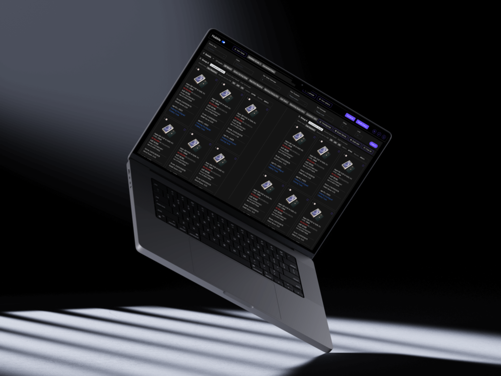
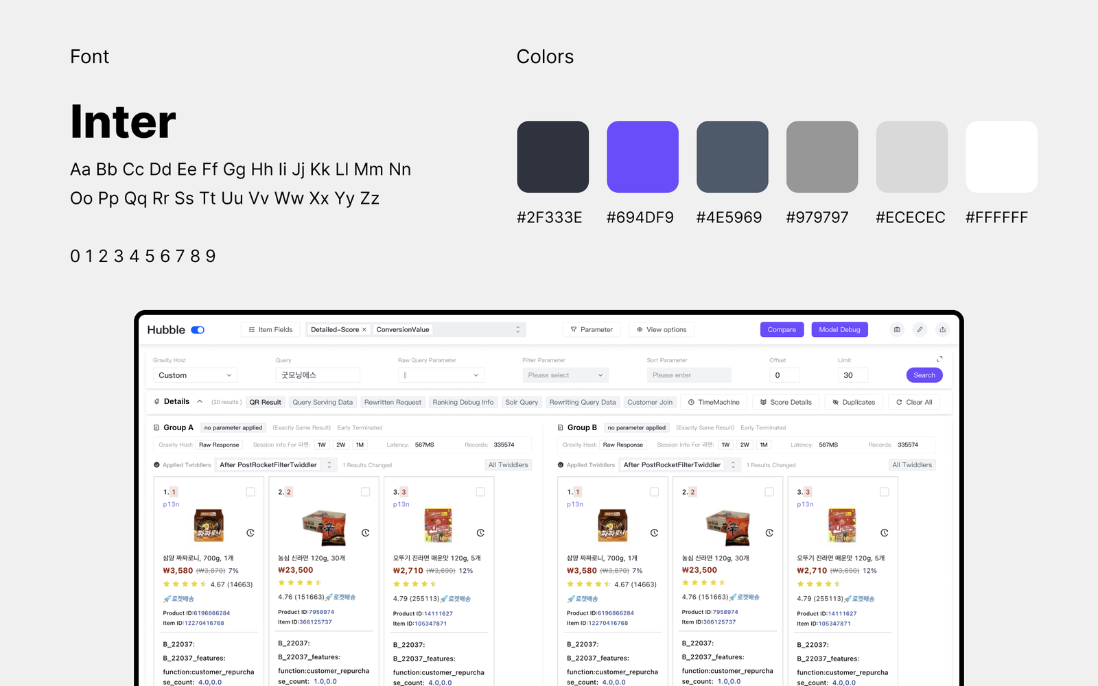
To reduce cognitive load and visual distraction, I introduced a minimalist visual system using neutral tones and a clean grid structure.
Key actions, such as Compare, Search, and Debug, were visually emphasized using vivid accent colors to guide user attention and improve discoverability.
Neutral elements were intentionally desaturated to create a clear visual hierarchy, ensuring high usability in both light and dark modes.
Results
Once the redesign was developed, we tested it against the old version—users worked faster, found the layout easier, and reported higher satisfaction.
40%
Increase in Visible Card Area
60%
Reduction in Time Spent Finding Functions
1.5x
Improvement in Load & Interaction Speed
85%
Positive Feedback from Internal Users (Post-launch Survey)