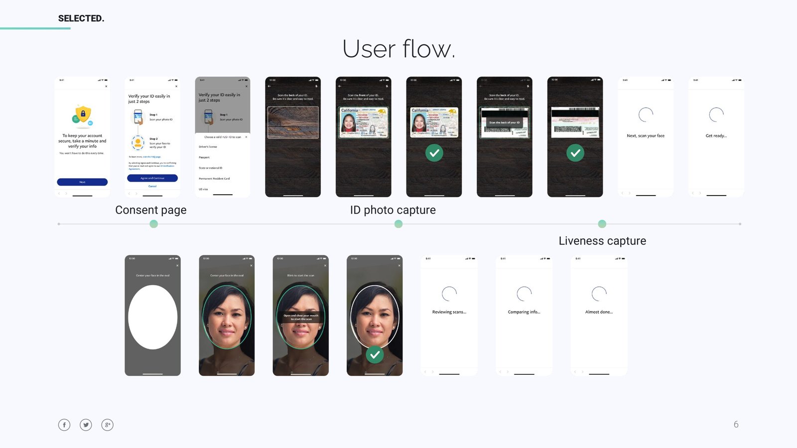
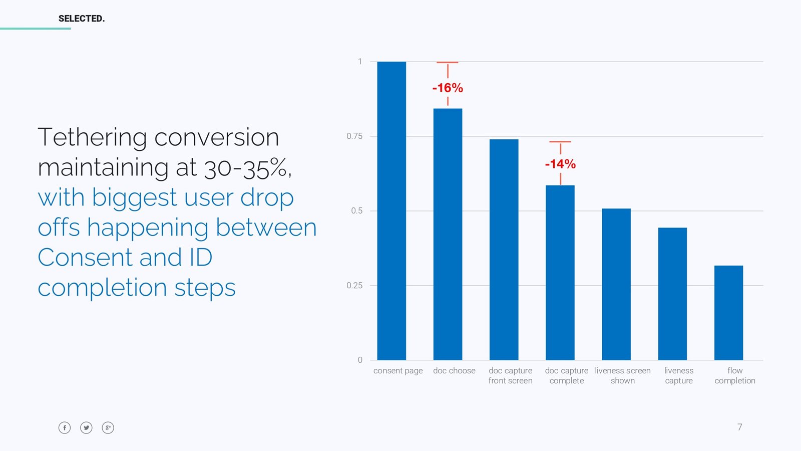
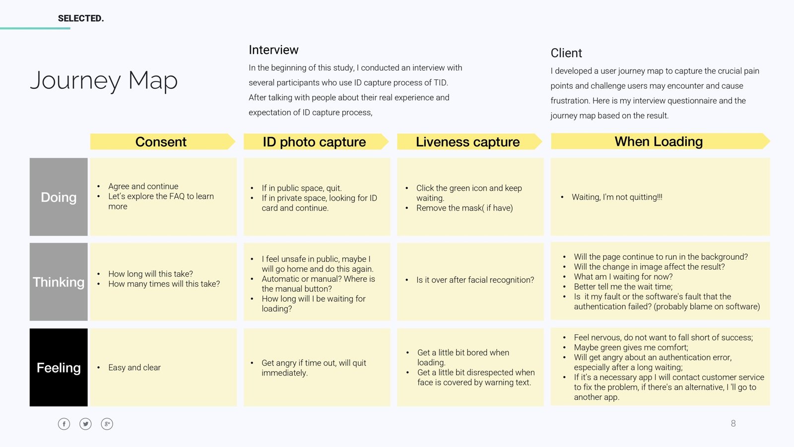
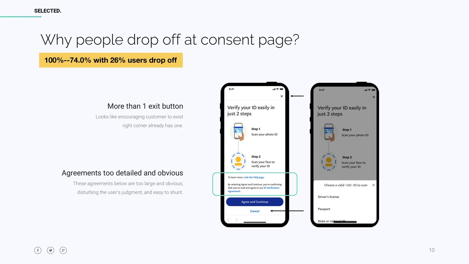
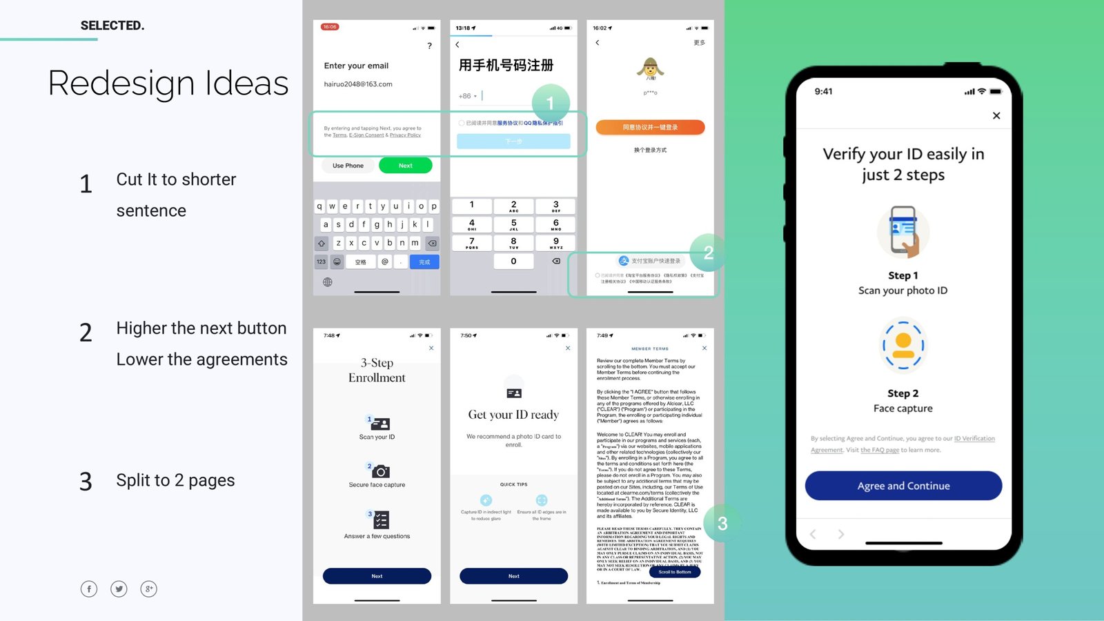
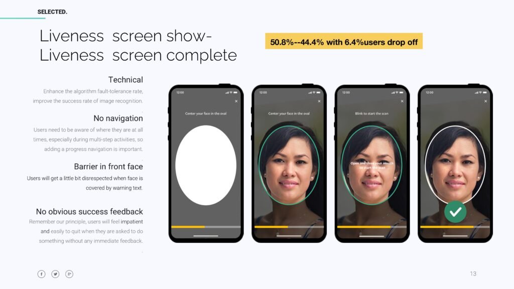
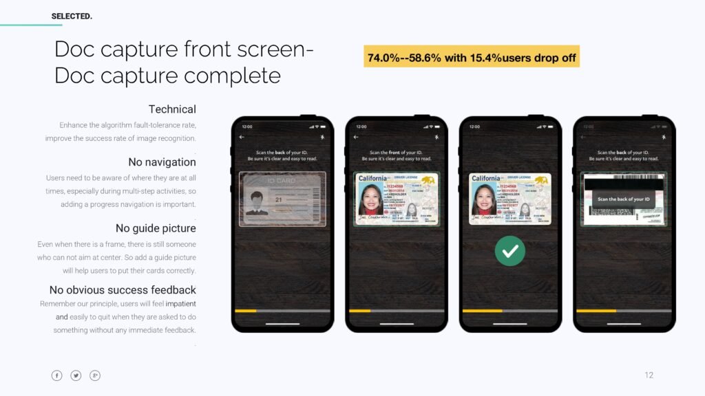
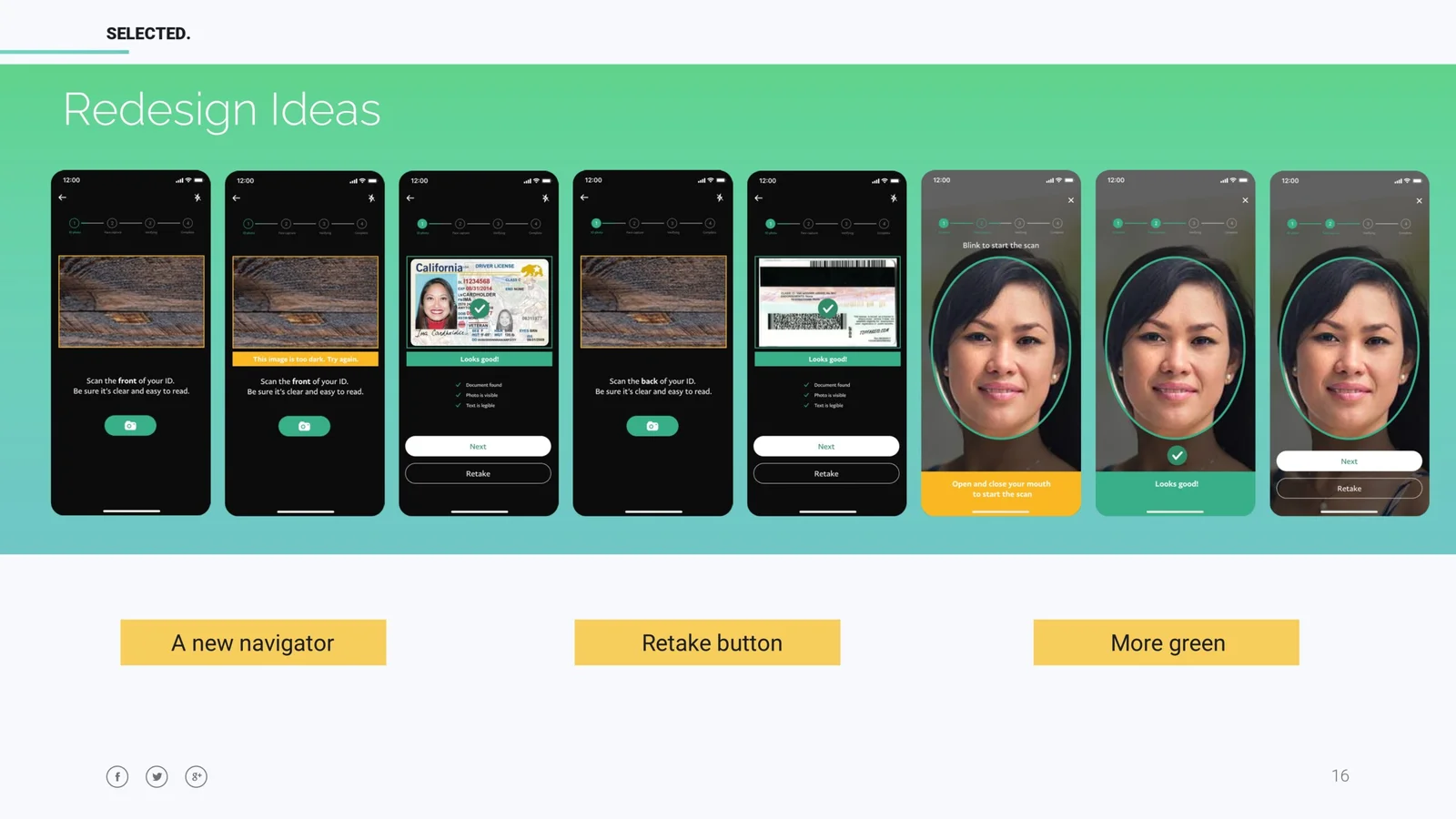
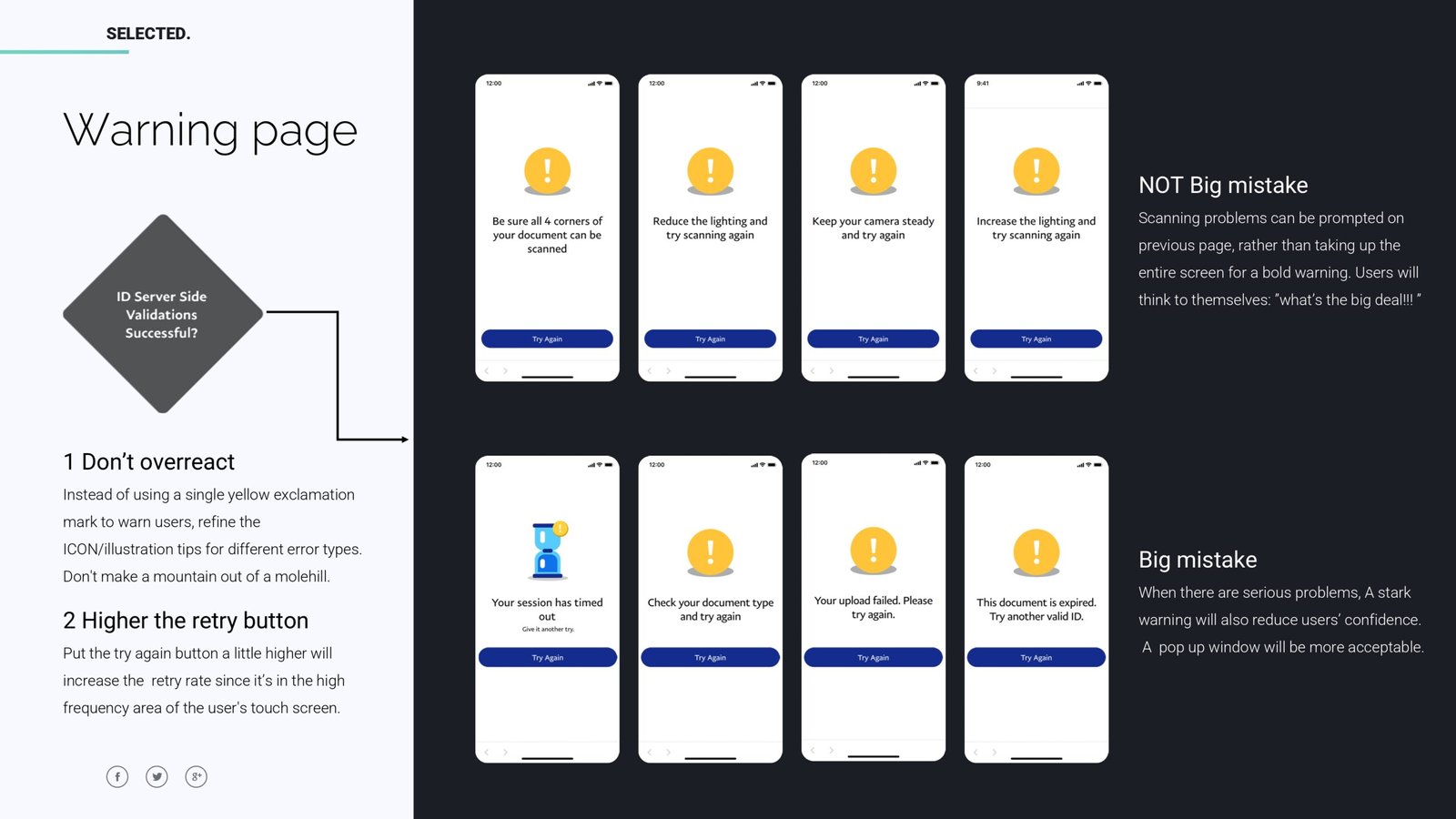
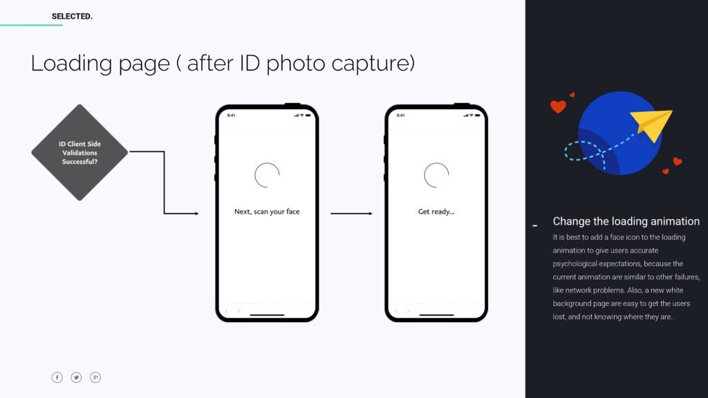
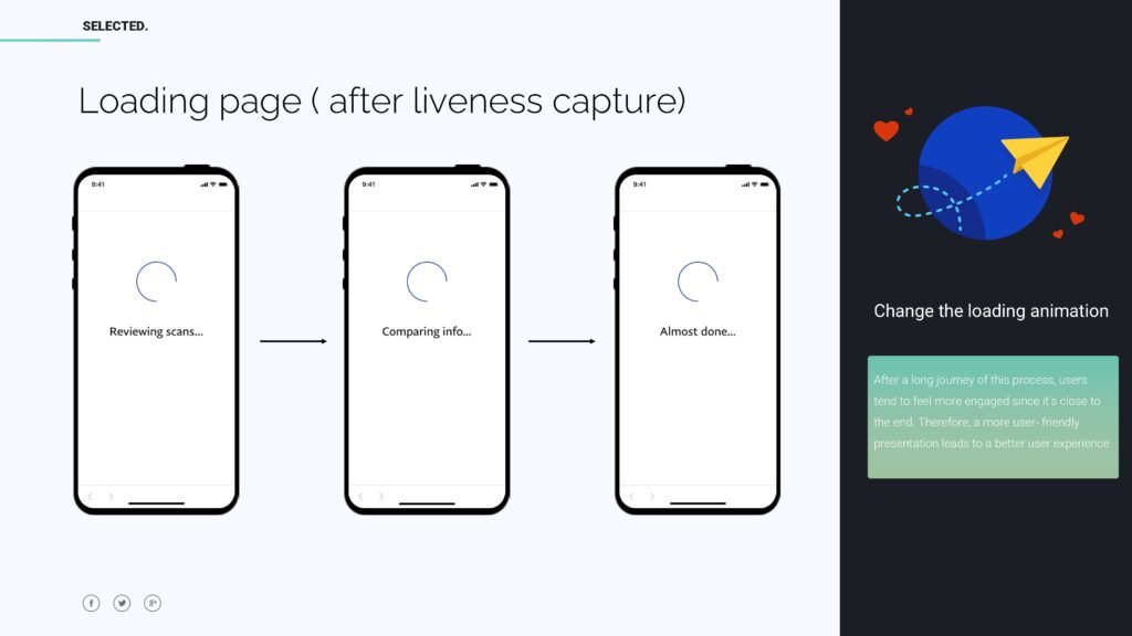
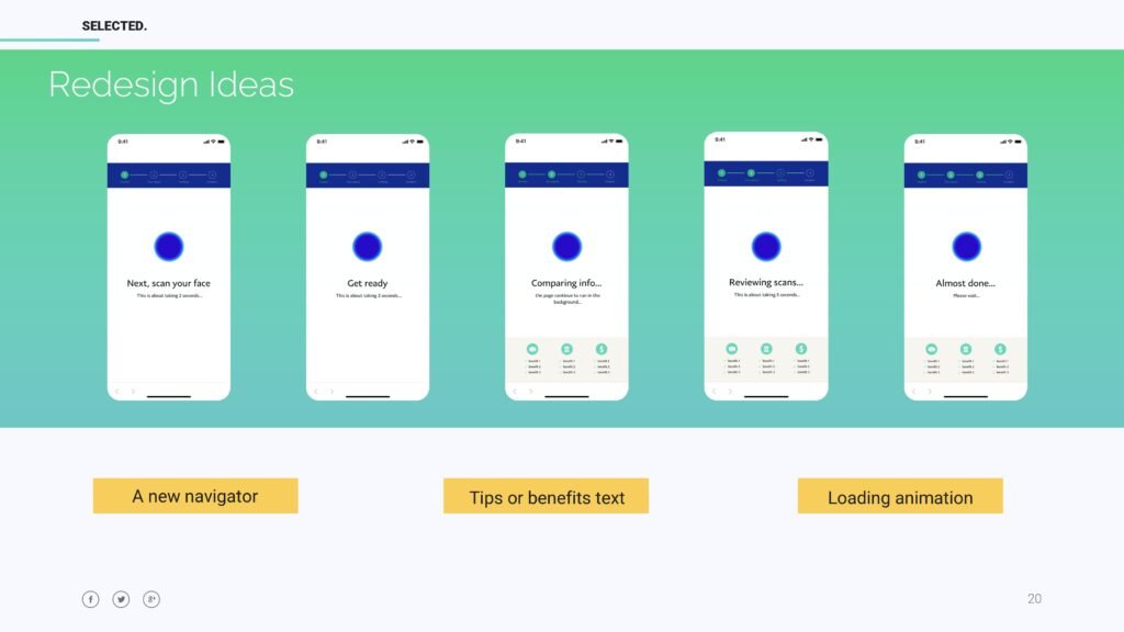
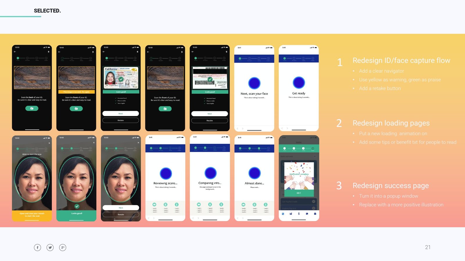
For this project, my task was to redesign the whole process of user interfaces to maximize the optimization of the user experience, analyze what caused the drop rate from a designer perspective, so that we could work on to reduce the user drop rate, and at the same time, make the interfaces more beautiful and coherent.
To find a simple solution to address this complex problem. I was focusing on improving emotional satisfaction to ensure pleasant experiences throughout the process.
The user flow involves multiple steps, particularly during the ID photo capture and liveness capture processes. If users are not familiar with these steps, they may become confused or overwhelmed by the actions.
The flow does not clearly show what happens if an error occurs, such as an unreadable ID photo or a failed liveness capture. Users may be unsure how to correct their mistakes or whether they need to restart the entire process.
Implement error prevention and recovery features. For example, if the ID photo is unclear, immediately prompt the user to retake the photo with specific tips on improving clarity. During liveness capture, provide clear instructions if the user fails to perform the required actions (e.g., not aligning their face properly).
Introduce more dynamic feedback during the capture process, such as real-time alignment guides or progress bars.
Here’s the redesign of these 2 stages. I put a new navigator above, added a retake button and added more positive feedbacks to every success steps. This could encourage users and also enhance user satisfaction.
Then it comes to the loading page. I addressed the problems here. People can make mistakes, so sometimes you don’t have to overreact on this. Mistakes can be identified as big mistakes and tiny mistakes. When there are serious problems, like session time out or document problem, a stark warning will reduce users’ confidence. A pop-up window will be more acceptable. But when there’s a scanning problem like lighting issues, rather than taking up the entire screen for a warning. Users will think to themselves: “What’s the big deal!!!”. But I didn’t get to redesign this part, because this wasn’t required, so I got to analyze and give a reference.
Then for the loading pages. There are 2 loading stages during the whole process: after the ID capture and after the liveness capture. Remember from the journey map, people can think A LOT during loading stages, especially after a long journey of this process, Users tend to feel more engaged since it’s close to the end. Therefore, a more user-friendly presentation leads to a better user experience.
Additionally, the progress indicators (“Reviewing scans…,” “Comparing info…”) are passive, leaving users unsure of how much longer they need to wait. For the waiting screens, it would be helpful to use more engaging animations or show an estimated time to completion to reassure users and reduce anxiety.
I added some critical visual elements, such as the tips for users to read when loading, loading animation, and also navigation above to track the progress and give users comfort to wait for another few minutes.
The optimized facial biometric experience design contributed to a better user experience and positive feedback was received. Although it’s a demo prototype and didn’t get to launch at the end, it’s still a valuable experience for me to act as a bridge between cross-functional teams for the first time and to share some design knowledge to those engineers.