Welcome to Hera's site

PayPal Mobile Onboarding Redesign

This project reimagines PayPal’s mobile onboarding experience, focusing on streamlining identity verification with biometric authentication. By combining user research, competitive analysis, and UX best practices, I redesigned the flow to reduce friction, improve feedback, and build user trust—creating a faster, more intuitive, and user-friendly verification process.

2 Weeks

Duration

Hera Hou

Team

Project background

PayPal is a leading global payment platform with over 400 million active users.

As mobile payments grow, users expect faster and more secure onboarding experiences.

The current mobile verification onboarding flow requires multiple manual steps, which lead to frustration and drop-offs. The conversion maintaining at 30-35%

Design Objectives

Simplify onboarding by reducing steps and enabling biometric authentication.

Improve completion rates, especially for mobile web users.

Build a faster, more trustworthy verification flow without compromising security.

Deliver a design aligned with PayPal’s brand and accessibility standards.

Four fundamental steps of the core experience

Step 01

Consent

Customer learn what are the steps to complete the flow and customer need to accept the consent, links to consent and FAQ give customers more information

Step 02

ID Photo Capture

Customers need to capture the proof of identity documents like drivers' license, passport and national id, etc.

Step 03

Liveness Capture

Customers need to submit the selfie, and in this process, customers need to blink their eyes to proof their liveness

Step 04

Flow Completion

Customers receive instant confirmation that their identity has been successfully verified after loading

Awesome Features

User Research:
Usability Test with Contextual Inquiry

I conducted usability tests, interviews, and a journey map to uncover pain points in PayPal’s onboarding flow. A competitive analysis of leading fintech apps provided best practices for guidance and feedback. These insights led to "How Might We" statements that directly informed the final design solutions.

93%

Test

59%

Analysis

73%

Interview

Interview
Journey Mapping
How Might We's
Design Solutions
Competitive Analysis
Insights
Usability Tests

Research Approach

To deeply understand user experience during PayPal’s Tethered ID onboarding, I conducted moderated usability tests combined with contextual inquiry.

- Participants were asked to execute the onboarding process on their own phones.

- At each step—Consent, ID Photo Capture, Liveness Capture, and Loading—I observed their actions and asked them to describe what they were thinking and feeling in real time.

- This method allowed me to capture both objective behavior and subjective emotions, providing richer insights than interviews alone.

Stage Doing Thinking Feeling Pain Points
Consent Clicks agree and continues “How long will this take?” Clear and easy None
ID Capture Looks for ID card “Is this automatic or manual?” Uncomfortable in public Privacy concerns, timeout issues
Liveness Follows on-screen instructions “Is it done after this?” Bored, disrespected Text overlay, unclear completion
Loading Waiting “What am I waiting for?” Nervous, frustrated No progress feedback, possible error

Journey
Map

We can find users show a shift from neutral → anxious → frustrated, which correlates with high drop-off rates.

Users feel safe and clear at the start

Insight 01

Users feel safe and clear at the start, but anxiety rises as steps become more complex.

Abandonment Triggers

Insight 02

Public environment discomfort and unclear instructions often lead to abandonment.

Lack of feedback causes frustration

Insight 03

Lack of feedback during loading causes frustration and blame toward the app.

Low intent and poor UX

Insight 04

Users drop off mainly from low intent and inconvenient, time‑consuming steps, not fraud concerns.

How Might We...

Allow users to save progress and complete ID capture later in a private environment, or offer guidance for secure capture (e.g., “Find a well-lit, private spot”).

Add real-time visual cues (progress bar, “Step 2 of 3”) and instant confirmation when the capture is successful.

Use progress indicators, estimated wait times, and reassurance messages like “Verifying your ID… This will take ~20 seconds.”

Explain benefits upfront (e.g., “Quick verification unlocks faster transfers and higher limits”), reinforcing value before the process starts.

Add privacy reassurance messages (“Your ID is securely encrypted and never stored on your device”) and use friendly, trust-building UI elements.

Competitive Analysis

Competitive Analysis

I conducted a thorough competitive analysis of current mobile onboarding processes used by leading fintech and identity verification apps. Among the apps reviewed, the Clear app stood out.

1. Guidance at every step: Tips on lighting, positioning, and avoiding glare reduce errors.
2. Progressive disclosure: Instructions are given right before each action, preventing cognitive overload.
3. Positive reinforcement: “Looks good!” messages confirm successful captures, boosting confidence.
4. Error prevention: Real-time warnings like “Try to avoid glare” help avoid failed attempts early.
5.Visual clarity: Clean layout, large buttons, and clear next steps make the process intuitive.

solution

Design solutions

Real-Time Feedback

Add a progress bar or step count to reduce uncertainty.

01

Progress Indicators

Use instant success feedback after ID or face capture to reassure users.

02

Contextual Guidance

Provide real-time tips (e.g., “Ensure good lighting,” “Hold ID steady”) at the exact step users need them.

03

Error Prevention

Display warnings before errors occur, similar to Clear’s “Try to avoid glare” message.

04

Design Prototype

Design Process

The redesign followed a user-centered, iterative process informed by user research, journey mapping, and competitive analysis. I identified key pain points—unclear steps, lack of feedback, privacy concerns, and error frustrations—then applied UX principles of clarity, feedback, user control, and positive reinforcement to improve the experience. The design was inspired by best practices from apps like Clear, which provide real-time guidance, success feedback, and simple navigation.

Redesign Prototype

Consent Page

Key Issue: The original design included multiple exit buttons (a cancel button at the bottom and a close button in the top corner). This gave users too many opportunities to leave the process, which could increase drop-offs.

Redesign Solutions:
1. I removed the extra cancel button, keeping only a single close button in the top corner.
2. I simplified the layout by moving the agreement text lower and shortening it for better readability.
3. The primary CTA “Agree and Continue” is now more prominent and easier to reach, reducing confusion and accidental exits.

ID Photo Capture Key Issues

No navigation: Users lacked awareness of where they were in the multi-step process.

No guide picture: Even with a frame, some users failed to align their ID correctly.

Liveness Capture Key Issues

Weak Progress Indication: Users cannot easily see how many steps remain or where they are in the process, leading to confusion and anxiety.

Overlapping Warning Text: Warning text covers part of the user’s face, which feels intrusive and disrespectful.

RedesignSolutions

1. A clear step indicator at the top shows progress (e.g., “Step 2 of 3”), helping users know where they are in the flow.

2. Added visual guidance and real-time tips (e.g., “Center your ID in the frame”) to reduce alignment errors.

3. Introduced green success states with a “Looks good!” message to confirm valid capture. And added a Retake button so users feel in control and confident when redoing steps.

4. Removed intrusive warning text and replaced it with gentle error prompts. Optimized use of colors: green for success, yellow for warnings, red for errors.

These changes reduced user uncertainty, improved task completion, and provided better feedback at every step, aligning with the principles of clarity, user control, and positive reinforcement.

Redesign - Loading

Loading Page Key Issues

Generic Loading Animation: The spinner animation looks similar to network errors, giving users uncertain psychological feedback.

Lack of Contextual Information: The messages “Next, scan your face” or “Get ready…” do not provide clear expectations of duration or progress.

No Progress Navigation: Users do not see which step they have completed and how many steps remain.

White Background and Minimal Indicators: The plain white screen makes users feel lost and unsure where they are in the process.

No Tips or Engagement Content: During waiting, users get bored or frustrated because there is no meaningful information or reassurance.

ID Photo Capture Key Issues

New Loading Animation: Introduced a face-related animation that feels relevant to the ID verification process and reduces confusion with network errors.

Clear Progress Navigation: Added a step indicator at the top, so users know exactly where they are in the onboarding flow.

Contextual and Time-Based Messages: Added messages like “This will take around 5 seconds” to manage user expectations.

Tips or Benefits Text: Added helpful tips or benefits (e.g., “Verified accounts enjoy faster transactions”) to reduce impatience and reinforce motivation.

Reflections

Reflections

Applying User-Centered Design

Redesigning PayPal’s Tethered ID onboarding flow was a valuable opportunity to apply user-centered design thinking to a complex verification process. Through user research and contextual inquiry, I uncovered key friction points—unclear steps, privacy concerns, lack of feedback, and error frustrations—that were strongly correlated with high drop-off rates.

Learning from Industry Best Practices

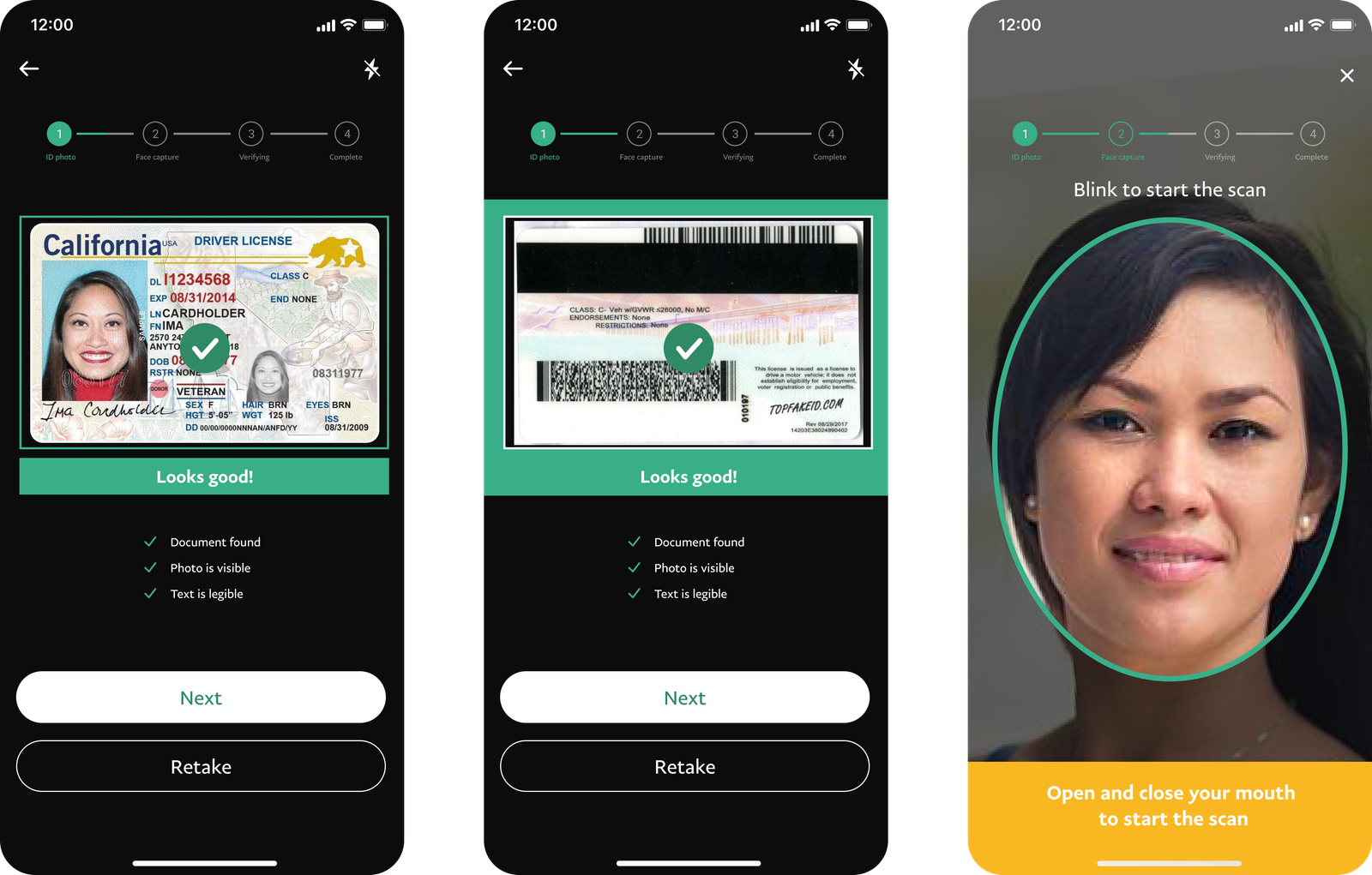
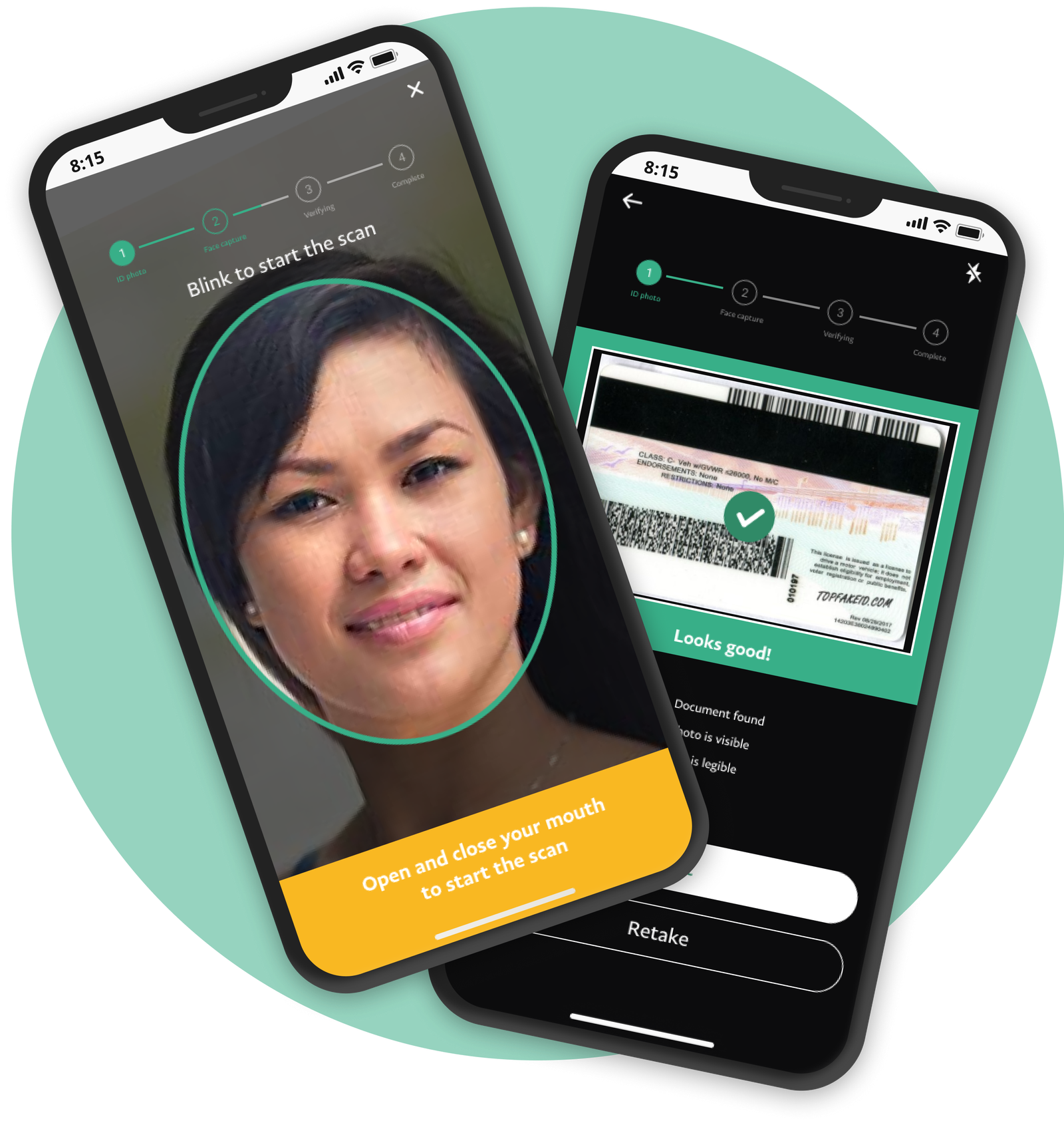
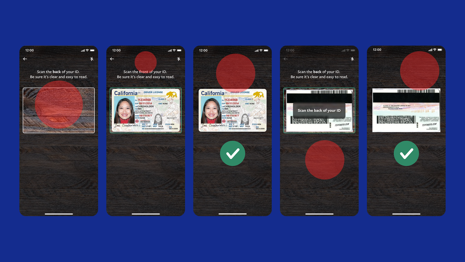
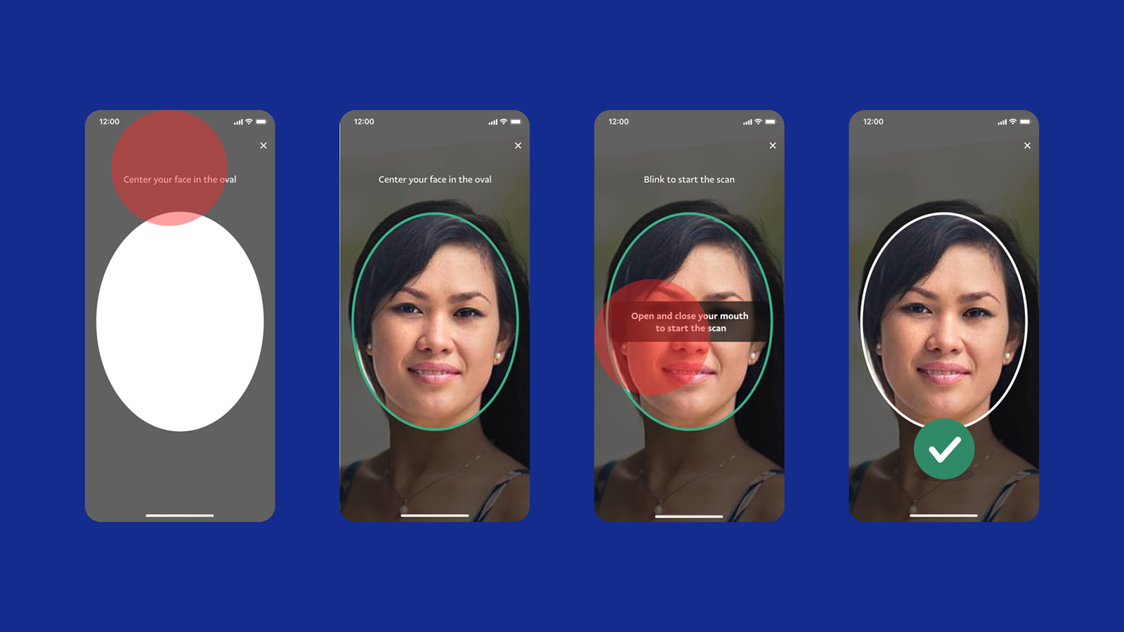
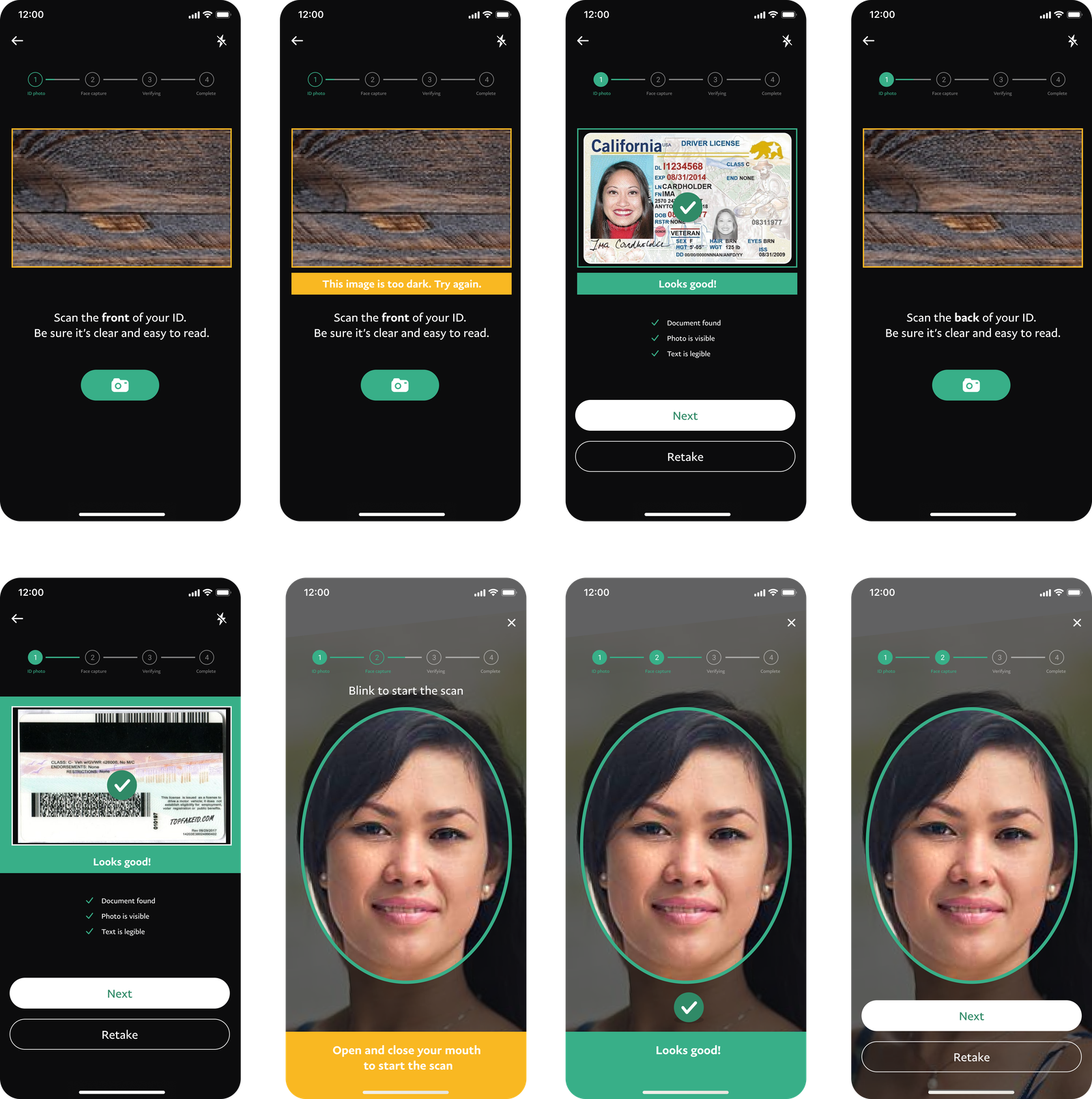
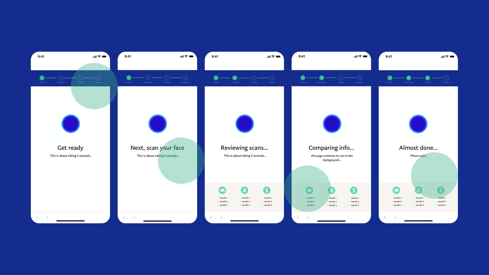
The competitive analysis, especially insights from the Clear app, reinforced the importance of real-time guidance, progress indicators, and positive feedback in identity verification flows. These best practices inspired many of my redesign solutions, such as guide images, success states, step navigation, and improved loading animations.

The Power of Small UX Details

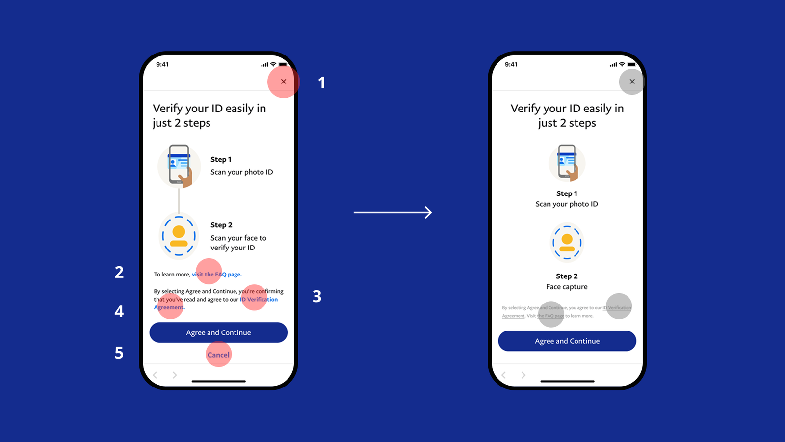
One of the biggest takeaways was how small UX details—like button placement, visual hierarchy, and microcopy—can significantly influence user confidence and task completion. By streamlining the flow and adding contextual reassurance, the redesign aimed to create a more trustworthy, faster, and user-friendly experience.

Designing for Empathy in Security Flows

Looking back, I realized that designing for security-heavy flows is not just about efficiency, but also about empathy—acknowledging user emotions and reducing anxiety at every step. This project helped me strengthen my skills in user research synthesis, iterative design, and communicating design decisions with data and evidence.

Future Opportunities

If I were to continue this project, I would prototype the redesigned flow and conduct usability testing to validate its impact on completion rates and user satisfaction. This would provide quantitative data to measure success and guide further refinements.